One-page vs multi-step checkout: which converts best?
Are you losing nearly 70% of your customers at the final hurdle? Choosing between a one-page and multi-step checkout can be the difference between a completed sale and a ghosted cart. Here is how to decide which flow fits your business.
When one-page checkout works best
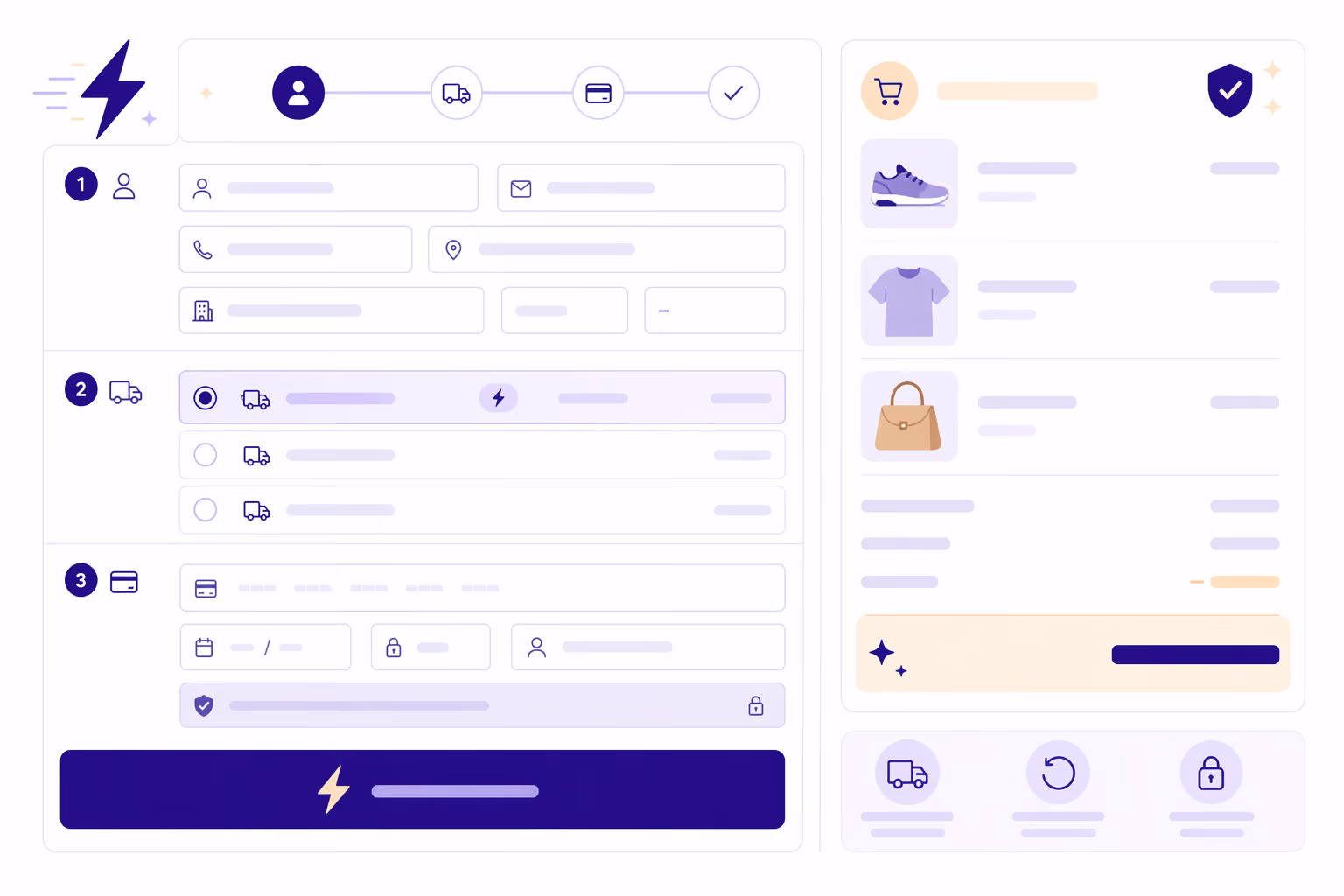
A one-page checkout displays every element – customer information, shipping methods, and payment details – on a single page. The goal is to reduce friction by cutting down the number of clicks needed to complete a purchase. Because they feel faster and more transparent, one-page checkouts often lead to higher conversion rates as shoppers know exactly how much effort is required from the start.
This layout works particularly well for low-cost impulse buys where the customer wants to finish quickly. It also suits returning customers who already trust your brand and want to get through checkout with minimal effort. Since 75% of ecommerce traffic now comes from mobile devices, a single scrolling page can feel more natural than navigating several separate ones. That said, design matters: if not handled carefully, a one-page layout can feel cluttered and overwhelming, which may cause shoppers to abandon their carts before completing their order.
Why multi-step checkouts still work
Multi-step checkouts break the process into clear steps – typically shipping details, delivery method, and payment. While this requires more clicks, it creates a sense of order and security that many shoppers appreciate. Research from the Baymard Institute shows that a one-page checkout is not automatically better than a well-optimised multi-step flow, particularly for high-ticket items.
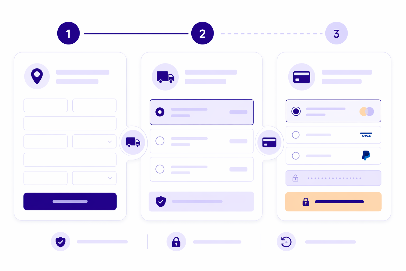
For complex orders, a multi-step process can outperform a one-page layout by making validation easier – users can review and fix errors in one section before moving on. Showing only a few fields at a time also reduces decision fatigue, keeping shoppers moving forward rather than stalling in front of a dense wall of form fields. These flows also create natural pauses where you can introduce relevant add-ons or flexible financing options without cluttering the main interface.
There is also a psychological dimension worth understanding here. Once a shopper has completed the shipping step and moved to the payment screen, they have already invested effort into the process. This sense of progress raises the cost of abandonment in their mind – a dynamic sometimes called the sunk cost effect. In conversion optimisation, this is a deliberate advantage of multi-step flows: each completed step makes the next one more likely. A shopper who has filled in their address is meaningfully more committed than one who has only added an item to their cart. If you want the structure of a multi-step flow without the separate page loads, an accordion-style checkout offers the best of both by keeping everything on one page while expanding each step as the shopper progresses.
How performance impacts your conversion rate
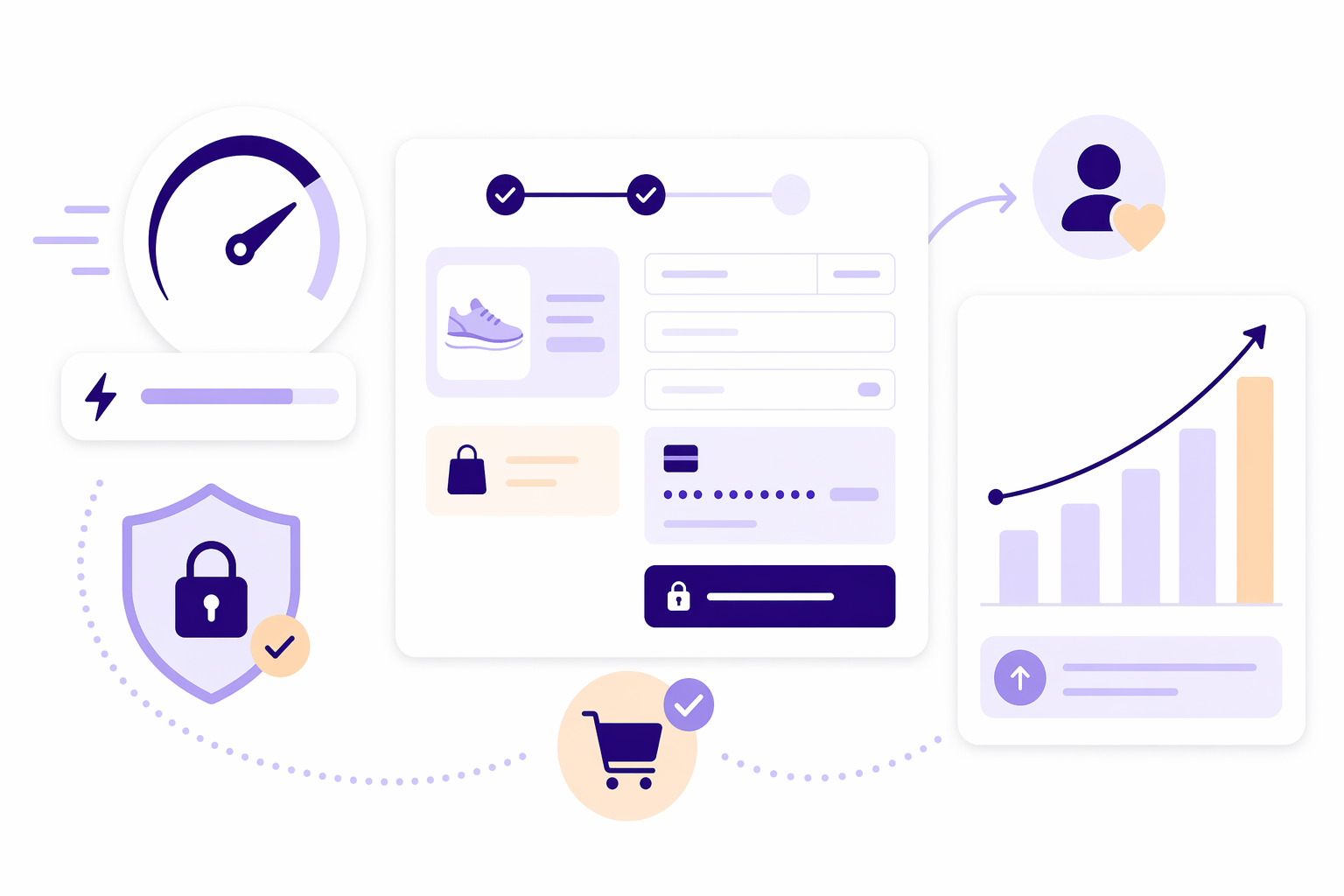
The most effective flow is the one that loads quickly and feels secure. Improving your site speed by just one second can boost conversions by 7%, meaning that a slow, heavy one-page checkout will always convert worse than a fast three-page alternative. To truly boost your store's conversion rate, look beyond the number of pages and focus on the overall experience.
Removing barriers matters more than layout choices in many cases. Whenever possible, enable guest checkout so first-time buyers are not forced to create an account. Address autocomplete reduces typing effort and errors. In regions like the Baltics and Poland, shoppers also expect local payment methods like BLIK or direct bank payments alongside standard card payments. Offering the methods your customers actually use is one of the most reliable ways to ensure they reach the finish line.
Choosing the right flow for your store
Your decision will depend on your platform and the type of products you sell. If you use a checkout plugin for WooCommerce, you often have the flexibility to test both styles and see which performs better for your customers. Products that are easy to ship are usually well-suited to a one-page flow. If you sell custom-made goods or items that involve more complex delivery options, a multi-step flow gives customers the confidence that every detail has been captured correctly.
Regardless of the structure you choose, the moment a customer pays – the payment gateway interaction – must be seamless. You can even show card fields directly in your checkout rather than redirecting customers to an external payment page. That distinction matters more than it might seem: keeping shoppers on your site through an embedded checkout flow is itself a conversion decision. Every redirect introduces a moment of doubt – a page load, a visual break, a reason to hesitate. Removing that redirect is one of the most direct ways to protect the completion rate you have worked to build.
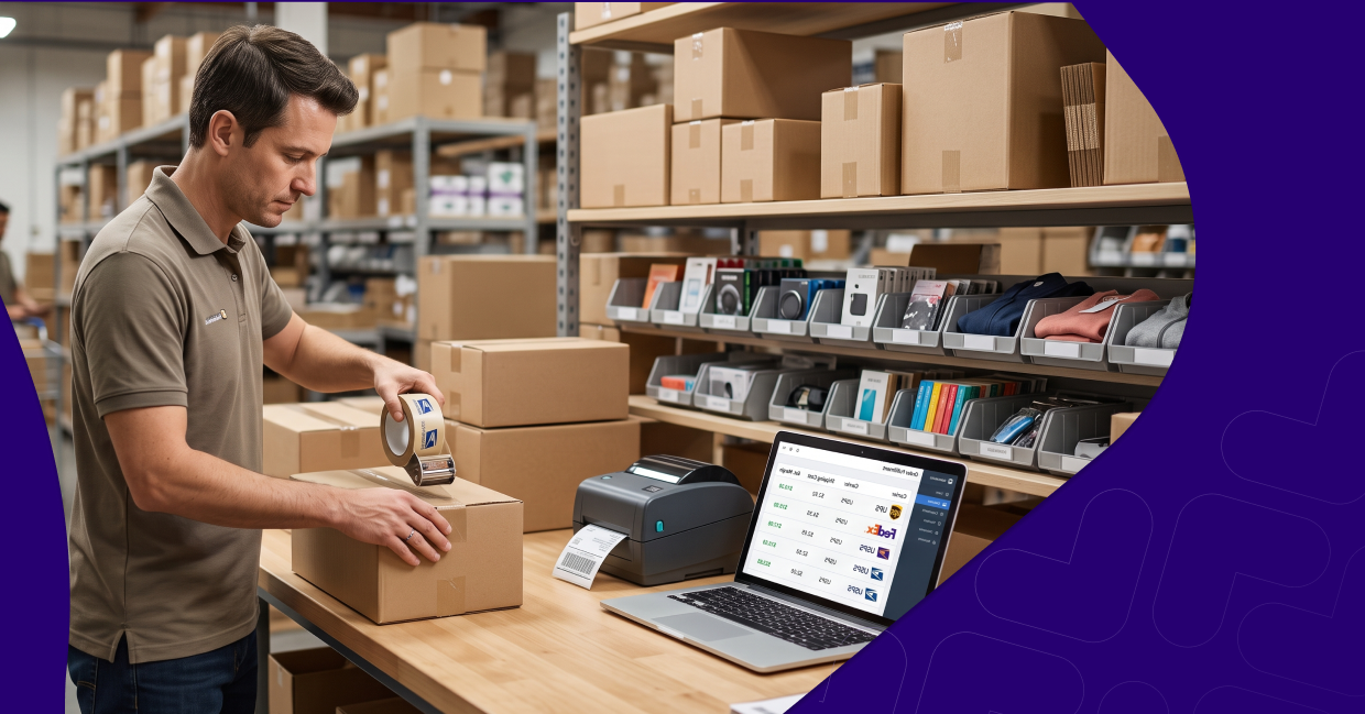
If you're looking for an embedded checkout built for Baltic and Polish merchants, explore Montonio's all-in-one payment and shipping solution and see how we help over 8,000 businesses drive more orders.