Cart abandonment starts at checkout – here's how to fix it
Across the ecommerce industry, the exact same mistakes appear consistently, regardless of vertical, business scale, or marketing budget.
Ecommerce businesses invest enormous resources in attracting users. They run campaigns, implement retargeting, focus on landing page optimisation, and conduct endless A/B testing on product pages. And then they let those exact users walk away at checkout – the very place where the purchase decision has already been made.
The statistics in this area are remarkably consistent: around 70% of carts are abandoned. That figure can be misleading, because it implies the problem lies with purchase intent. But a user who has entered the checkout already has that intent. They chose a product, accepted the price, and made a decision. What stops them is often a poorly designed purchase path or an unoptimised checkout.
How our brains make decisions at checkout
To understand why users abandon carts, it is necessary to understand their mindset when they finally hit the checkout button. In his bestselling book Thinking, Fast and Slow, Nobel Prize-winning psychologist Daniel Kahneman describes two distinct ways the brain processes information: one mode is slow and analytical, while the other is fast and automatic.
Choosing a product, reading reviews, and comparing offers engages that slow, analytical side. It requires time and effort. But when a user enters the checkout phase, their brain wants to switch gears into the fast, automatic mode. They simply want to finish the transaction on autopilot, not analyse new information.
The problem is that most checkouts are designed as if the user still wants to think.
Forms with a dozen fields, disorganised payment methods, and error messages that require interpretation all jolt the user back into an analytical state. The most jarring disruption happens with a sudden change in price. When a user sees unexpected shipping costs, taxes, or service fees added at the final step, they feel tricked. They immediately stop asking "How do I finish this?" and start asking "Is this actually worth it?"
Every extra hurdle demands attention and mental effort. The moment the frustration of checking out outweighs the desire for the product, abandoning the cart becomes the easiest option. This isn't a matter of willpower – it's a psychological mechanism that a checkout design either accounts for or ignores.
The address form as a design test
The address form is a good starting point because most stores treat it as a purely operational necessity. Yet it has an enormous impact on the entire purchase process.
A classic address form looks like an internal logistics document: separate fields for street, building number, apartment number, postal code, city, country, and phone number – often required without any explanation.
The problem is compounded by a common sequencing mistake: many checkouts ask for a full delivery address before presenting delivery options. A user fills in every field, only to then select a parcel locker, making most of what they just entered irrelevant.
To make matters worse, many checkouts present users with a seemingly endless, unorganised drop-down list of parcel machines. This kind of design flaw forces the user to search through hundreds of locations – often with no alphabetical sorting or distance filter – transforming a simple task into an agonising, minutes-long search for their nearest option.
This wasted effort and visual overwhelm is exactly the sort of friction that pushes people towards the exit.
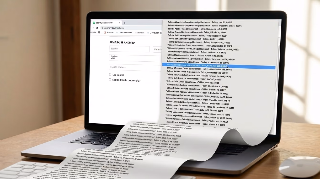
On a desktop, this is inconvenient but manageable. On mobile, however, where the vast majority of shopping sessions now happen, it's a genuine obstacle. Even those who get to the end and complete the purchase don't forget the experience; a checkout that felt unnecessarily painful makes them think twice before coming back.
Research shows that around 18% of users abandon a cart specifically because the checkout takes too long (Baymard Institute). No technological revolution is needed to fix this. A few simple changes are enough:
- Address autocomplete after typing a few characters, instead of manual field-filling.
- Automatic city population based on the postal code.
- Triggering the correct mobile keyboard (e.g., the numeric keypad for phone numbers and postal codes)
- Pre-filled data for logged-in users.
- The option to save an address as default, reducing the entire step on repeat purchases to a single-click verification.
Each of these solutions removes a moment where a user might decide to walk away.
The problem with too many payment options
Intuition suggests that more payment options mean a better experience. The thinking goes: the more methods you offer, the greater the chance everyone finds theirs. But user behaviour contradicts this – seeing too many options doesn't make the decision easier; it makes it overwhelming.
When a user sees seven equally weighted payment methods with no clear hierarchy, they have to stop and evaluate each one. That forces them back into a thinking state at the exact moment they just wanted to wrap things up. The result? Some users give up because picking an option feels like too much effort.
This is especially true when checkouts offer multiple services that do exactly the same thing. For example, presenting a customer with multiple different Pay Later providers. To a shopper, these options look almost identical. Forcing them to stop, read the fine print, and choose between competing brands just to split a payment adds unnecessary friction. They are now evaluating financial providers, rather than simply paying for their order.
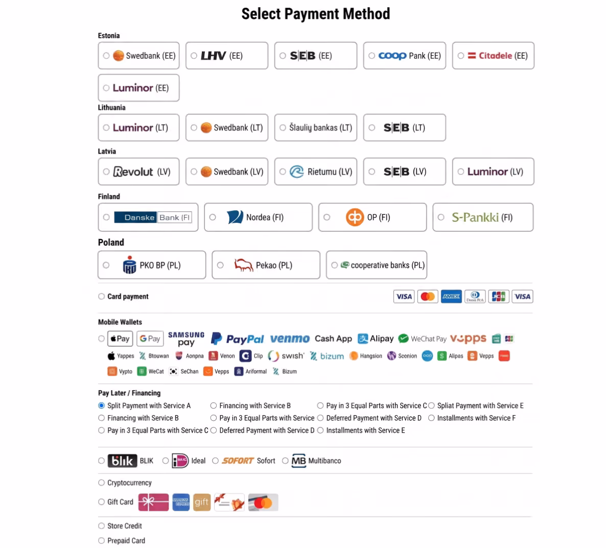
At the same time, there's an equally powerful counter-mechanism: 76% of users abandon a cart if they can't find their preferred payment method (Applause, Digital Payments Survey 2024). This means the problem isn't the total number of options, but whether the right option is immediately visible.
Too many choices create paralysis; too few create frustration. The answer is a dynamic checkout. Show people the options they are most likely to use, first. Rather than presenting all methods in a fixed order, the system should adapt the view to the context:
- Device
- Location
- Cart value
- Behaviour
A user on mobile should immediately see Apple Pay or Google Pay – one action, no data entry. The same user on a desktop should see local bank payments first. On higher-value orders, deferred payment options like Pay Later or Financing can be prioritised to ease the immediate financial weight of the purchase.
A payment error as a detour, not a dead end
Failed transactions are a natural part of the purchase process. They happen due to insufficient funds, technical issues, interrupted sessions, and network drops. At scale, this is a constant – a few per cent of transactions will fail on the first attempt regardless of checkout quality. The problem isn't the failure itself. It's what the checkout does with it.
In most stores, a failed payment message sends the user backwards: to the beginning of the checkout form, back to the shopping cart, or sometimes even to the homepage. A user who was already at the finish line suddenly faces having to go through the entire path again. Their motivation plummets, and giving up becomes the rational choice.
A well-designed checkout treats an error as a minor bump in the road. The system remembers the user's data and cart contents. Instead of sending them back to the start, they are taken directly back to the payment selection screen with a helpful suggestion: "Card payment failed. Try a fast bank transfer or Apple Pay." If the session was interrupted, a link to complete the payment can be sent by email or SMS, taking them directly back to where they stopped.
It is worth auditing what happens after a failed payment in any store. In many cases, that is exactly where businesses are losing users who genuinely wanted to pay.
Designing the last 30 seconds: where to start
Most of the changes described above don't require a massive platform migration or a costly development sprint. Here are five areas ecommerce businesses can address today:
- Address handling: Enable address autocomplete. Fill out the city automatically if the user enters the postal code. Add pre-filled data for returning users as the default behaviour, not just an option.
- Payment method hierarchy: Review payment gateway dashboards to see which methods customers use most. Use that data to set the order of methods in the checkout. What works in one store may be completely different in another, depending on the audience, product category, and the devices used to shop.
- Error recovery: Check where a user lands after a failed transaction. The worst system is one where the customer is redirected to the homepage. Implement cart and data persistence after an error, so the user returns directly to the payment selection screen.
- Post-abandonment communication: If contact data is available for a user who didn't complete a purchase, a recovery link to the checkout should go out automatically within the first hour.
- Guest checkout: Check whether the store requires account creation to complete a purchase. For a first-time buyer, that's an unexpected barrier at the worst possible moment. Offering a guest checkout option removes that friction entirely; they can always be invited to create an account after the purchase is complete.
Checkout is often the most neglected area in ecommerce. Marketing owns traffic, product teams own the inventory, and user experience owns the product page – but the moment a user loses motivation and closes the browser tab often belongs to no one.
That is exactly why the checkout in most stores looks the way it does – not because nobody knew how to fix it, but because fixing it wasn't in anyone's specific job description. By taking ownership of these final 30 seconds, businesses can ensure the sales they have already earned actually cross the finish line.
Quick audit: Check your store today
Before making any major changes, take five minutes to test your current setup:
- Try to buy something on your phone. Does the numeric keypad pop up automatically for the phone number and postal code fields?
- Simulate a failed payment. Where does the error or "Back" button take you? Do you have to re-enter your delivery details?
- Count the clicks. How many clicks does it actually take from "Add to Cart" to "Order Confirmed"?
Want to see how your checkout measures up? Reach out to us.